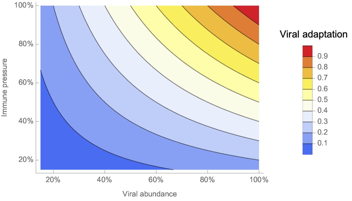
I've redrawn this concept here. We have viral abundance on the x-axis in arbitrary units of 0% to 100% and population immune pressure on the y-axis also in arbitrary units. Viral adaptation is plotted by color and is just abundance × immune pressure. 4/19
— @trvrb
contributed by Andy on Nov 26, 2021