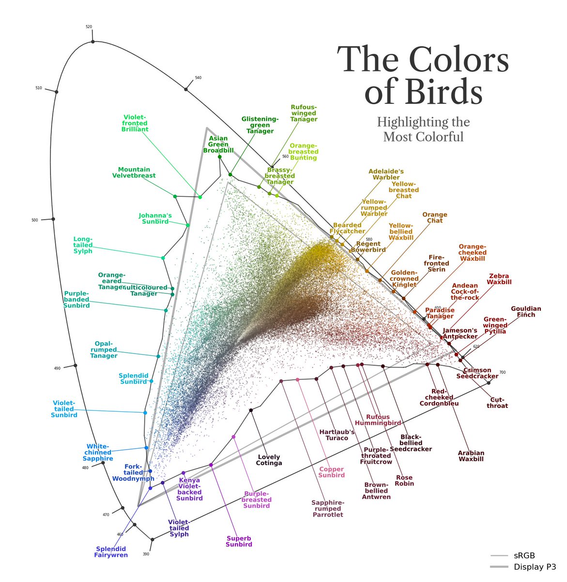
Real plot nerds might be curious how I got the text labels around the periphery to be so orderly. I computed the convex hull of the data then computed 3 expansion shells of that hull. Sequential labels alternate between each of the 3 hulls, and go to the closest spot on the hull.
contributed by Andy on Aug 16, 2026